Monday, October 28, 2013

Avedon


This portrait is a little different from Avedon style because of the lighting on the face and the background, however I feel that it captures the intensity of the eyes that adds a sharpness to the photograph with the help of the lighting.
The subject of the photo is of to the side and has a softer feel than the first photo. I like the eyes of the subject how they where caught in the moment in response to what was happening. I told a story to get a more candid photo.
I found that getting the model to keep moving and not just stay in one position helped me to get a photo that is more in the moment and natural as opposed to posing and thinking of when the photographer would take the picture. 

This photo shows lots of emotion that you are able grasp. I think the eyes and the  body language helps one to interpret the feeling of the photo. I gave the model direction and I took my time to place the subject in the desired area to accomplish what I wanted in the end. 

This is a captured movement and I like how the model isn't straight up but leaning to one foot. The lighting on the shirt starts dark and lightens as it reaches the face, which draws attention to the face. I like the contrast in the background with the patterned shirt that the subject is wearing and I feel that it also contrasts with his face. It helps to bing attention to the strong gaze of the subject.


Monday, October 14, 2013

Favorite Assignment

*none of these photos are edited or have any effect on them.

 I really like this photo of rule of thirds with the foreground in focus. The natural green of the moss adds a vibrant pigment to the sombre cement coloring. There is also a contrast of natural liveliness that adds warmth to the cold majority of the surface 
This photo exhibits leading lines and repetition on the trees to great depth. I find this photo interesting because the light that your eye is drawn to also shows depth. This is interesting because usually, darkness exerts a feeling of depth and in this photo, the roles are flipped.
This is looking up at a tree and falls under the 3-by-3 rule. I like it because there is such a contrast between the bland but royal blue sky and the intricacy of the leaves. There is a contrast of texture.
This photo includes repetition, leading lines, and foreground background focus. I like it because there is a combination of natural and industrial content: the drops of water on the car surface. I think it is a really nice foreground focus with a blurred background and you can still see the leading lines and repetition that exists in the blurry background.
I really enjoy the shadows of the object of this photo and the highlights you get from the sun. This photo has rule of thirds and foreground background focus. the coloring of the flower against the mostly grey background makes it stand out. Also i really like how there is a object of nature contrasted with the cement in the background. 

Monday, October 7, 2013

The Art Exhibit

The art exhibit 
Rule of thirds  to draw attention to the sculptures and the  interviewee, the artist.

Action breaks down at the exhibit and things get dirty. Also using the rule of thirds in the top right intersection and the lower left intersection to show the connection from one thing to another (the sculpture and the person) 
This is to show the perspective of the people and had a blurred background with the subject in motion. 
The paparazzi runs in fear, leaving the artist alone with his creations. There is a feeling of depth with the size if figures in the foreground compared to the background.
The sculptures were attacking the artist because they wanted him to respect their privacy. Rule of thirds is exemplified here with the left vertical third blank and empty.
SUCCESS!

Thursday, September 26, 2013

Rule of Thirds

I see this as the rule of thirds because the subject of the photo is off to the left and stands out against the blank background 

This is rule of thirds because the bricks are in the lower right section and is the only object to be drawn to.

The light in this photo is the subject and the focus of this picture and hits the intersecting point of a grid exactly. This demonstrates the rule of thirds because of the lights position and how your eye is drawn to the subject.

The white door takes up a third of the photo and is heavily contrasted with the vibrant green color of the leaves if you compare this photo with the next, you can see that your attraction is always drawn to the white door.

Comparison to the previous photo.

This shows rule of thirds because the blue sky takes up the top third while the patterned fence takes up the bottom third. Also the photo is broken up in vertical thirds as well though not as extreme as the horizontal split. the flowers bring color to one side of the photo. 

the sky and the buildings are separated in thirds where the top third is taken up by the sky and the lower portion is the building. I think that since the buildings are very very patterned and uniform, you are attracted to the building.

This demonstrates rule of thirds with the designed window in the top left and then the contrast of nature with architecture in the left part of the photo. 


This demonstrates the rule of thirds because the middle of the plant is directly on the intersection point and it helps that there is a blend in color that helps to bring your attention to the middle.

Tuesday, September 17, 2013

other depth photos

 This is a photo with focus on the rusted staples and nails on this telephone post. I like the size comparison between the forward staple as opposed to the ones further back, creating depth, and then finally the blurred background, which completes the feel of the photo.
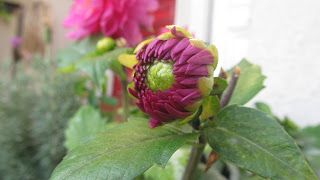
 This photo is of a budding flower with the blurred background of a fully bloomed flower. This is physical depth as well as a look to the future of this flower bud. This was taken using the macro setting.
 This photo is focused on the thin leaves and highlighted by the blurred red background of a door.
This photo is focused on the leaf with a scattered blurred background around, as well as inside of the focused object.
This photo draws in a focus to the deeply colored object that is contrasted by the light blur of the background, creating depth.

Friday, September 13, 2013

Background, Foreground focus


 Blurred foreground with focus on the background. I like how this photo creates depth with the repetition in the background. 

 Blurred background with focus on foreground. This photo is the opposite of the one above and the leading lines in the left front area of the picture help to contribute to the depth of the photo.

Blurred foreground with focus in the background. I like that the dark color of the border contrasts with the vibrant color of the foreground focus and helps you to lead your eye to the main focus.


 Blurred background with the focus on the leaf. I like how the outer edges of the leah are so defined and you can see it almost as a silhouette. The blurred background is really contrasted behind the sharp leaf.

*These photos were all taken in the autofocus setting

Tuesday, September 10, 2013

Leading Lines and Repetition to show depth

Leading Lines

Leading Lines

Leading Lines

Leading Lines

Leading Lines

Leading lines of colored lines and cracked line

Repetition of a pattern


Repetition of windows

Repetition

Repetition of washing machines

Repetition of windows, the little nob and fire escapes

Repatition

Friday, August 30, 2013

3 by 3


 flower from above view
flower from below view 
flower from middle view 


flower from above view
flower from below view
flower from middle view


 window sill from above view
 window sill from side view
window sill from middle view


Thermometer from above view
 Thermometer from below view

Thermometer from middle view